If the idea of starting a website redesign project has you a little worried. You’re in the right place.
I’m going to tell you how to refresh your website so it meets the needs of your customers and your key stakeholders while causing a minimal amount of disruption to your business. You in? Let’s go!
More...
A website redesign project is a massive undertaking filled with a high level of risk. You have to have experience, buy-in from key stakeholders, and really awesome project manager to redesign your website with a minimal amount of disruption to your company.
In contrast, refreshing your existing website require you to blow everything up and start from scratch. It’s an evolution, the next best possible version, of the website you have today.
In my past corporate career, the most successful improvements to conversion rate occurred through minor tweaks to the existing design. Evolution in the existing design to meet customer needs and demands. It works surprisingly well.
In one particular case, simplifying and shortening the messaging for returning customers at a key point improved conversion rates by 3.8%. That seems like a small number, but it translated into a big revenue number for the company. I also designed a 3-click reordering process that the company still talks about in their marketing - and this design change was made over 10 years ago.
Here’s a secret some marketers don’t like to talk about
There is no “one size fits all” conversion optimization plan for every business. Your business and your customers are unique and any reputable marketer will respect this and not try to shoehorn you into something that just doesn’t fit.
Growth hacks may be incredibly appealing and give you a short-term boost but hacks aren’t designed for long-term growth.
The key to improving your sales and overall website performance is threefold:
- Know your numbers (your key KPI’s - where they are now, what your goals are)
- Know your customers (who they are, why they buy, why they don’t buy, what their primary pain point or desire is, and the overall level of awareness they have of your company as a solution). Refresh and update your customer personas as you discover additional customer insights.
- Put in the work on a consistent basis. Results appear over time not via magic wand.
Suggestions for refreshing your website without undergoing a redesign.

These suggestions are good for any website in just about any industry and you can start these at any time and, as a bonus, many don’t require the same sign-offs or hassles that come with a large scale web redesign project.
One note before you begin.
Make sure you’re tracking key metrics before, during and after each of these refresh updates - you’ll want to track your progress over time or, if the worst should happen and your customers don’t respond to your changes in the way that you hoped, you can reverse the changes quickly.

Tidy up your pages (Marie Kondo style)
Eliminate some of the clutter and re-organize the content in a way that makes sense to your customers.
- Adjust your content hierarchy to the needs of your customers. If your customers tell you that saving time is their most pressing need, but you are addressing this concern at the bottom of the page, you have an opportunity to shift things around.
- Test your website on multiple browsers and devices. All browsers are not created equal - replicating equivalent experiences across the board and providing a consistent experience can result in unexpected conversion increases. You can start with any one of a handful of cross-browser tools but nothing replaces the first person experience of testing and reporting not only functional issues but visual issues as well.
- Here’s an example of a website issue I found on a client's website - all because I looked at the website in a different browser. The image is accidentally duplicated - it appears the parallax setting on this content block is having issues with this browser.


Audit your content
- Reorganize existing content. Evaluate each piece of content for relevance and recency. Examine blog tags and content sections, rename, consolidate, and eliminate as needed.
- Eliminate irrelevant content. There is some content that can’t be resurrected or updated and needs to be eliminated. Make sure you create an appropriate redirect to support any active links and check for any broken links created by removing this content.
- Update out of date content. If you notice that some older content is still driving a decent amount of traffic or the business has turned back towards supporting the concepts within the content it may be worth refreshing, updating, and republishing the content.
- Repurpose valuable content. Give high-value content a new life and a new audience by creating additional supporting content, videos, infographics, quotable snippets and more.

Revitalize your messaging
- Revise your value proposition and other headlines. Over time the needs, pain points and awareness level of your customers will change. Sometimes simply revisiting your value proposition and other supporting content will provide a boost to your conversion rates and customer engagement without the hassle, time and expense of a redesign.
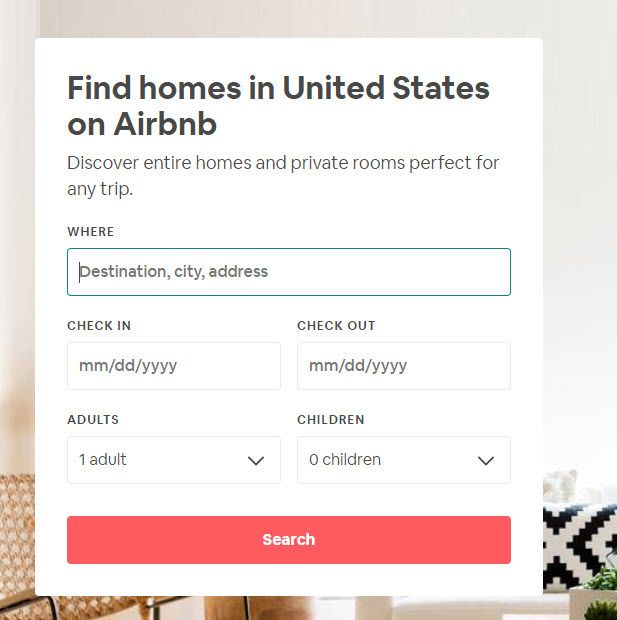
- Re-evaluate your calls to action and buttons (Microcopy). Consider what your prospective customers really want and link your calls to action to your value proposition. Opt for more descriptive calls to action that resonate with potential customers on a “hell yes!” level over basic CTA’s like “learn more”. Airbnb does this well on their home page, telling the website visitor what to enter in the "where" field - simultaneously encouraging action and giving instructions.


Spruce up your visuals.
- Reduce image file sizes. If your images are old or outdated chances are the images on your site are oversized files and are slowing your pages down.
- Update your images and icons. Update images to meet changing customer personas and replace on a page by page basis. For instance, if your brand has migrated to lighter colored imagery and a positive tone and some of your pages have darker and more angsty images, it might be time for an update.


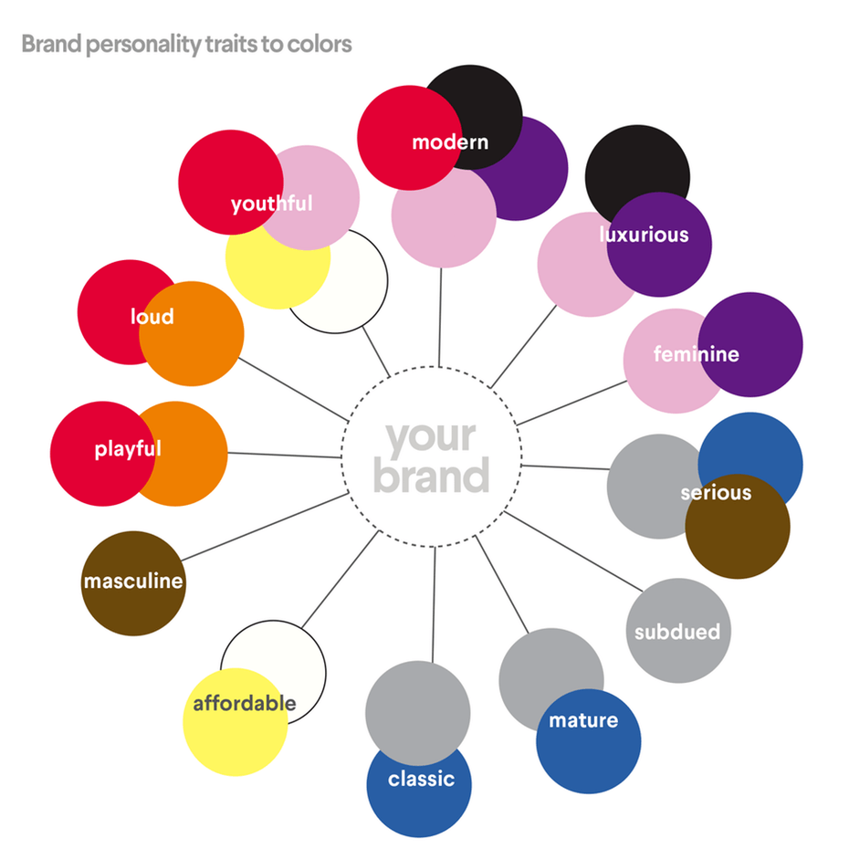
- Change background colors or create visual blocks. Help your customers through the page and encourage conversion-triggering behavior. Engage psychological principles through the use of color to encourage feelings of trust or excitement.
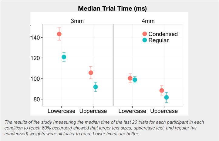
- Update the fonts or global styles. Make text easier to read with an update to global headers and paragraph text. According to Norman Nielsen, larger, wider, and capitalized text outperformed smaller, narrow, and lowercase text for “skim”-based reading or “glanceable fonts” - which is what most of us do with websites.
Website redesign projects can be time and resource intensive, and the results aren’t always guaranteed. Refreshing your website a little at a time allows you to retain control over the project, the timeline, and the (hopefully) positive results.
Not quite ready to get started on website refresh projects? No worries, just download the guide for future use.


